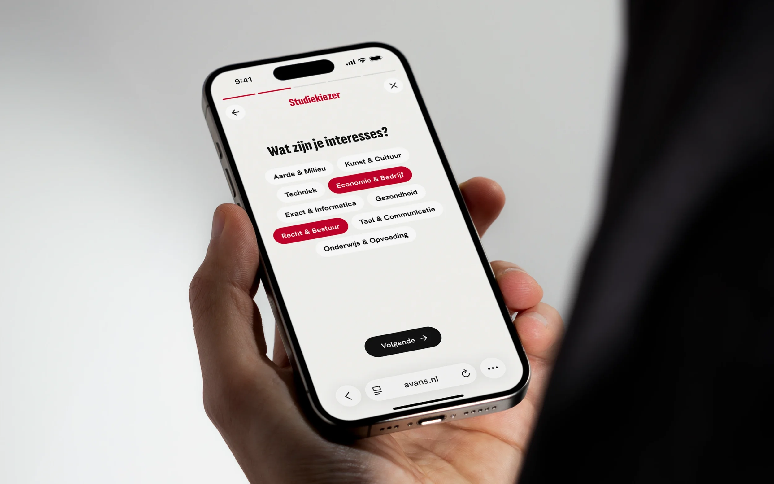
Avans - Refresh & Redesign
Client
Role
Avans Hogeschool
UX & UI Design
Summary
Avans is one of the largest universities of applied sciences in the Netherlands, serving thousands of students and staff across multiple locations. Following an offline brand refresh, the university needed to translate the new visual identity into a consistent digital experience across its website, internal platforms, and design system.
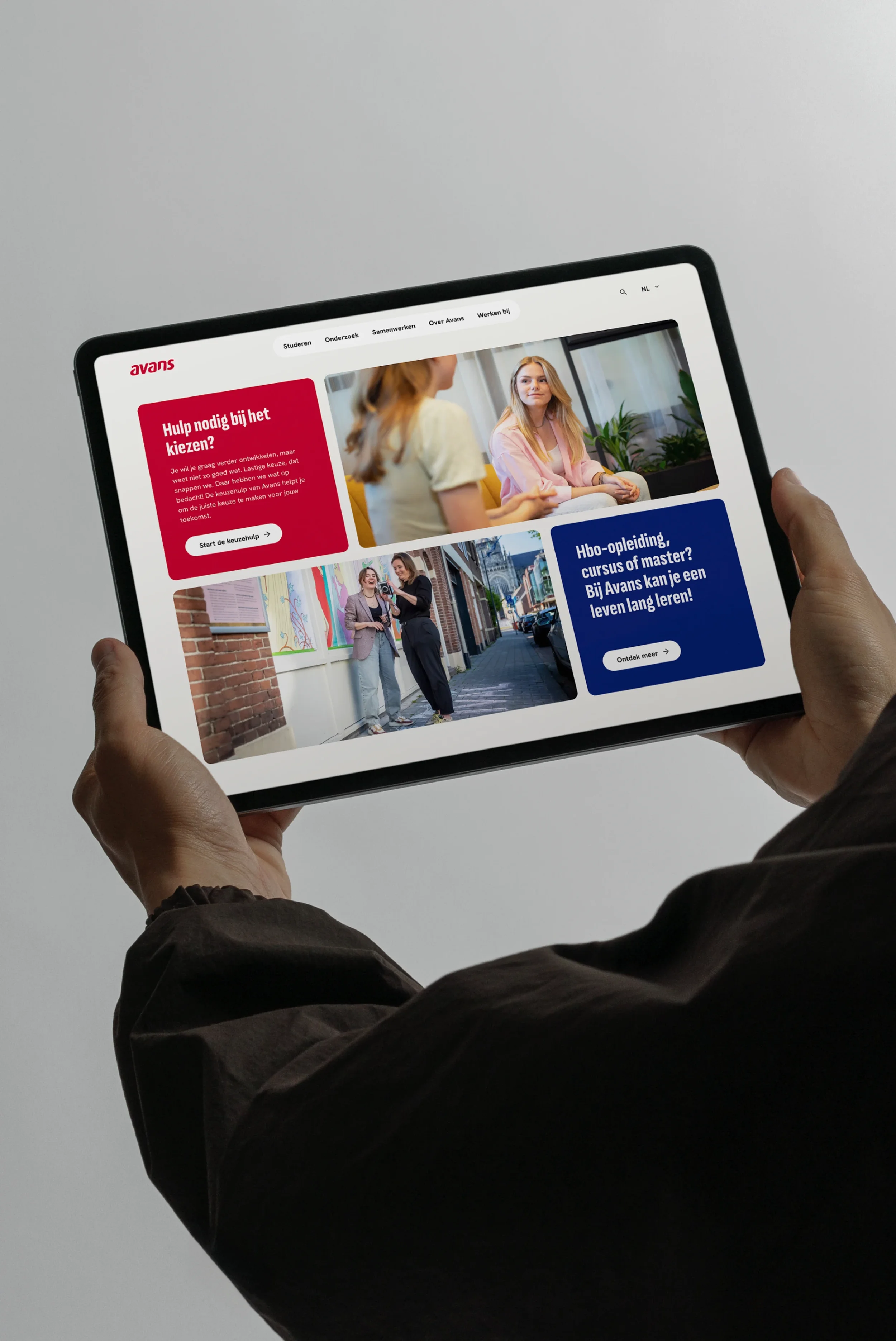
As a senior product designer, I led the translation of the refreshed brand into digital products, including the public website, student and teacher environments, and a scalable design system. My role included contributing to strategic workshops, defining digital design direction, and delivering development-ready designs that ensured a consistent and accessible user experience.
Challenge
The brand refresh had initially been developed for offline use, leaving a gap between the new visual identity and the existing digital platforms. Translating this offline brand into a cohesive digital experience required clear decisions about typography, color usage, and visual language across different screen sizes and contexts.
Aligning stakeholders from multiple departments was another challenge. To support this process, I actively contributed to workshops where the team explored pain points, discussed priorities, and determined the scope for the digital transformation. In these sessions, I helped the team structure ideas, translate feedback into actionable design directions, and ensure alignment across platforms.
Additionally, the digital ecosystem included multiple products, such as the public website and internal portals for students and teachers. Maintaining consistency across these platforms required establishing a scalable design system with reusable components and clear guidelines.
Solution
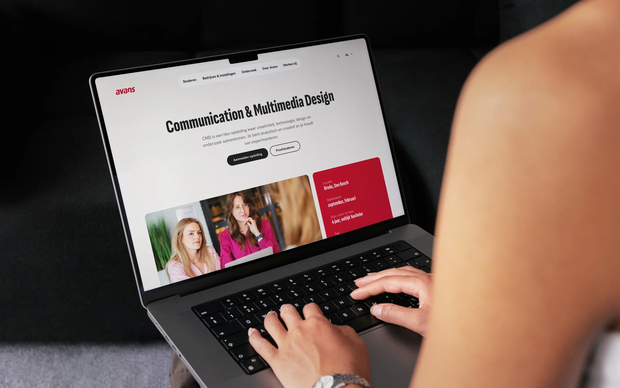
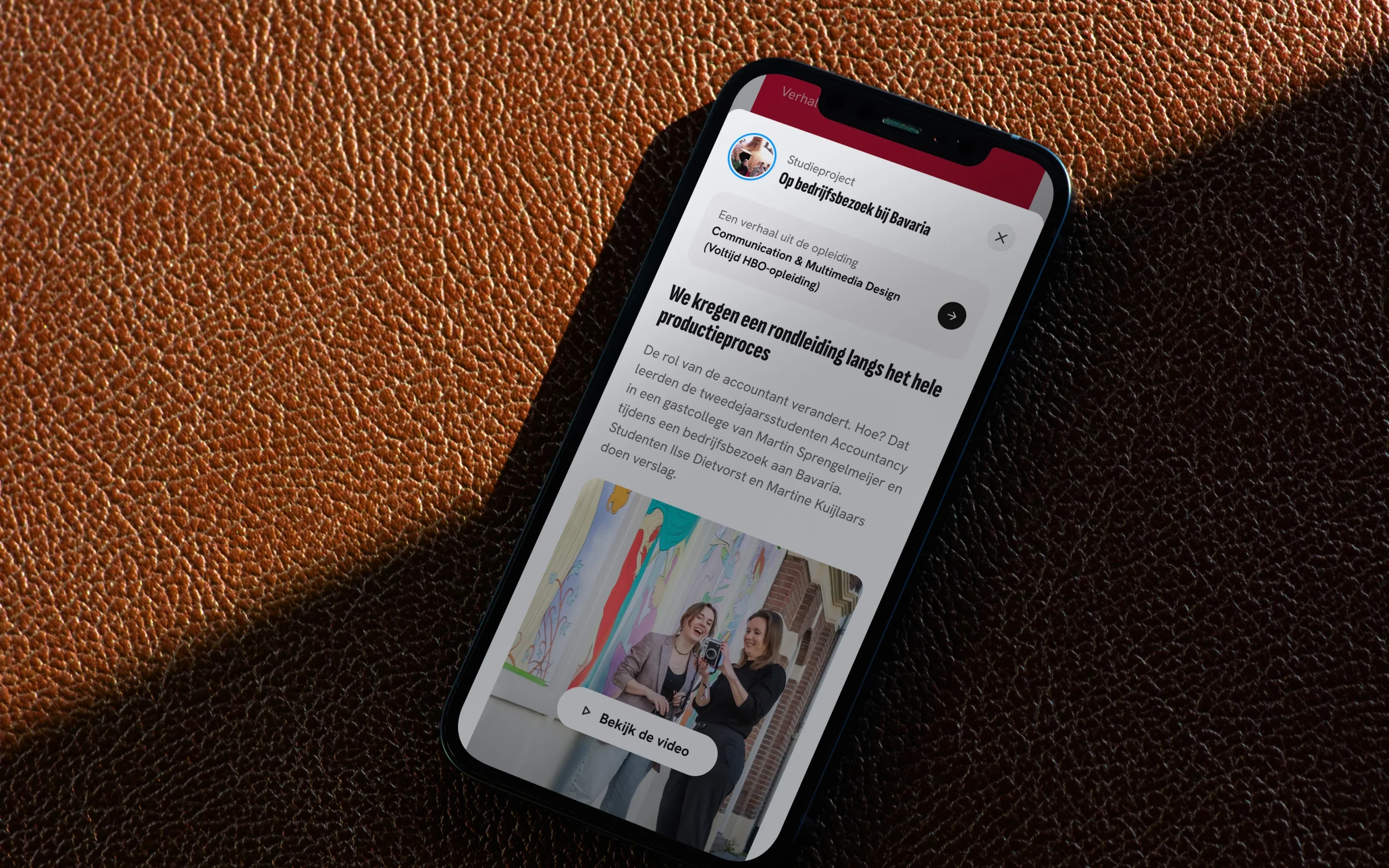
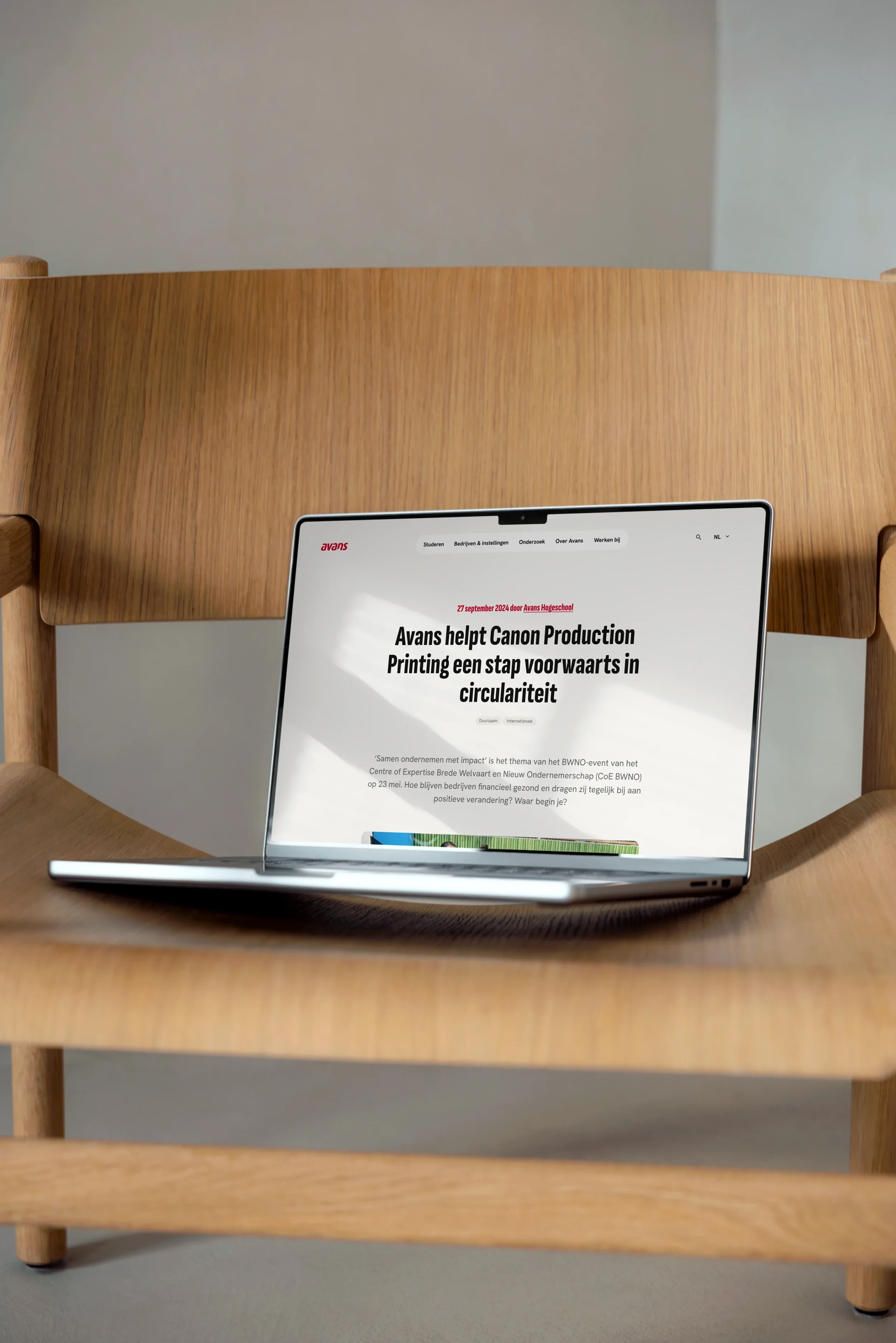
Based on the insights from workshops and stakeholder discussions, I helped translate the offline brand into a digital-first visual language that was accessible, scalable, and consistent. I designed the public website and contributed to the redesign of student and teacher portals, focusing on clarity, usability, and seamless navigation.
To ensure long-term consistency, I set up a design system with design tokens in close collaboration with developers. The system included reusable components, style guidelines, and documentation that enabled multiple teams to implement the brand consistently across platforms.
Throughout the process, user feedback and testing were integrated, allowing designs to be iterated and refined before final delivery. The end result was a cohesive digital ecosystem that reflected the refreshed brand, supported user needs, and provided a scalable foundation for future digital initiatives.